Review copy provided by Ubisoft Spain.
Introduction
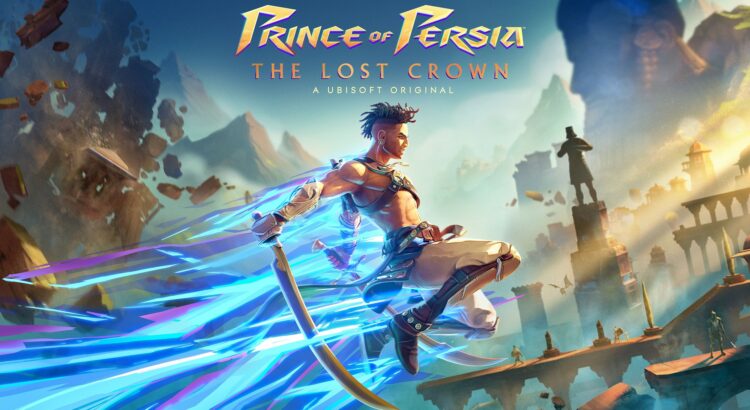
Prince of Persia: The Lost Crown is the latest entry in the well-known and beloved Prince of Persia series. The game combines fast paced combat, platforming and exploration in a fresh and challenging way. All these elements cannot be very accessible for a low vision player, but as a longtime fan of this franchise and this genre, I was excited to see if Ubisoft had managed to make it possible to overcome the classic barriers while keeping the challenge alive, as their Accessibility Spotlight showed some interesting inclusive design features. In this Low Vision review, I put on the mantle of Sargon, one of the Immortals, and face a new adventure while keeping my eyes open for the greatest treasure of all: accessibility.
Settings
Initial Setup
Launching the game for the first time we get to adjust some initial settings.
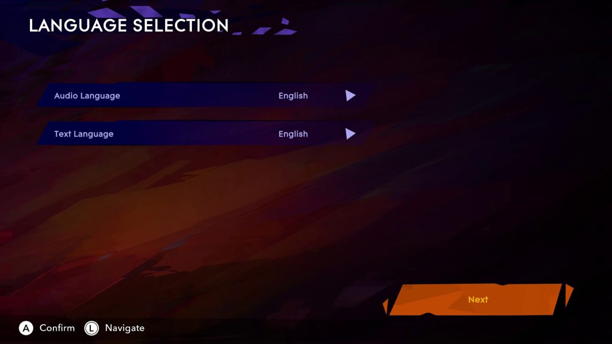
The first initial screen is to change Audio Language and Text Language. The first things worth mentioning here are the menu contrast and font that are quite good to read. Moving between options highlights in blue with white corners that is very noticeable. When selecting the Next button, it is highlighted as orange making it very clear and easy to see.


The next screen is brightness. In this Calibrate menu we can only adjust the brightness.
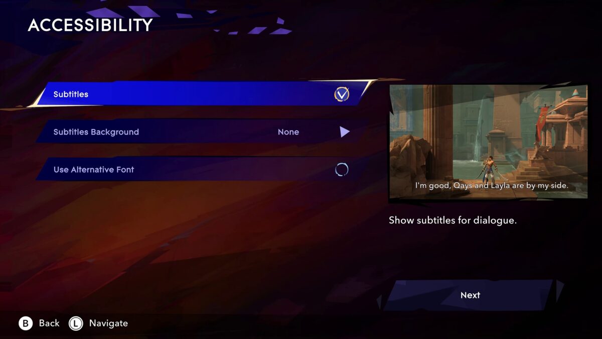

The third and last screen is Accessibility. Here we can enable or disable Subtitles, change its background between None, Semi-Transparent and Dark. Finally, we can enable or disable the Alternative Font. I’ve tried it to see how it looks, but to be honest I prefer the original font because it is bolder and easier to read for me, but it’s always good to have alternatives.
Before moving into Options, I want to mention that it is better if you start a new game first and then access the Options menu once in the game, because in the main menu you can only see Display and Sound options. So, let’s create our Profile. We can create up to three Profiles and the fourth being the Cloud Save in case you want to play in multiple platforms, and you can transfer your progress.
Starting a New Game, a Game Mode screen pops up to choose between Exploration and Guided modes. The Exploration mode will show minimum map icons, and everything must be discovered by the player while exploring and the Guided mode will display objective markers, blocked and unlocked paths. I chose the Guided mode because I need these icons to navigate more easily and not get lost.
Then, another screen is shown to choose the game’s difficulty from Rookie, Warrior, Hero and Immortal. Rookie being the easiest and Immortal the hardest. The last difficulty mode is Custom where we can adjust how easy or hard each part of the game is. We can adjust Enemy Damage, Enemy Health, and Environmental Damage from 0.5 to 2.0. Choose Parry difficulty from Hard, Normal and Easy, Dodge Windows from Long and Normal, Athra Depletion Rate from Off, Slow, Medium, Fast and Very Fast, and finally Athra Gain from 0.5 to 2.0. The base values are usually 1.0, so you have room to reduce or increase to adjust to your needs. This gives the player the possibility to customize their experience and what type of challenge they want. I personally like to play any game at the standard difficulty, so I chose Warrior and pressed A / Enter to start.
Now in the game, we can access all the Options.
Options
Under Gameplay we can enable or disable the Guided Mode that once disabled we’re playing in Exploration. Disable Screen Shake that I turned On because when the screen shakes I can’t see anything. Enable or disable Visible Interactions that once enabled it displays markers on interactable elements.


Turn On or Off the Melee Targeting that once enabled it will face your character in the direction of an enemy when attacking. Choose the Aim Assist Strength from Normal and Strong. Turn On or Off the Platforming Assist that when enabled lets the player create portals to skip challenging platforming sections. The Platforming Assist can be very useful for many, but for me that I like to find every crystal and collectables, it removes the ability to find those, because we’ll skip the whole section. But it makes me very happy that this feature is there to help players overcome some very difficult areas.
And finally, enable or disable the Auto-Unfreeze that performs the unfreezing automatically without pressing buttons quickly. I personally only use the Visible Interactions and Auto-Unfreeze, because I love platform games and their challenges and to be honest, so far, I didn’t need most of these assists.
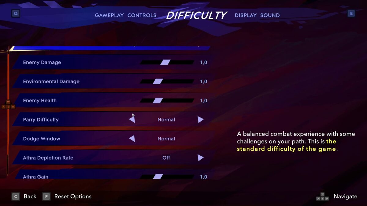

In the Difficulty tab we can adjust the overall difficulty like mentioned earlier with an extra option. Here we can also adjust from 0.5 to 2.0 the Athra Loss Rate from Damage, giving another touch of customization to the player.


Under Display we have a few interesting options. Like mentioned in the Initial settings, we can customize the Subtitles with the exact same settings as well as the Use Alternative Font. Additionally, we have the HUD Scale that we can choose from Normal, Medium and Large. I obviously chose the Large HUD Scale. I can’t really see much of it, but it helps when I zoom in to see how much health I have.
Lastly, but not least, we have the High Contrast Mode where we can choose from Disabled and 3 Presets with different colors. Once choosing one of these presets, two more options appear. Desaturated Background that allows you to remove the background’s colors and Colored objects that will color our character, enemies and objects.


In the Sound menu we can adjust Master, Music, Sound Effect, Voice-Over and Menu Volumes from 0 to 10. I have Music Volume set to 7 so I can hear other sounds more clearly.
Gameplay
When in control of Sargon for the first time we can read the tutorials at the top of the screen. These tutorial prompts have a sound cue when they are displayed. Although the text is big, I can’t read them, but the size seems to be very decent. Then we get to fight a few enemies. The first thing I’ve noticed is that the feedback, both visual and audio, on each hit are very good. In this initial area, I tried to use the high contrast mode to test it, and I noticed that in dark areas I can see enemies better without this feature, because the enemies blended with the background, but more about that later.


After fighting a few more enemies the game freezes to give the player time to read about the perfect parry mechanic. This is one of those zero consequence tutorials that I personally love so much, because the game unfreezes after you press the button. This reduces the pressure and improves the learning curve. Also, these perfect timing parries that allow you to perform a special attack, are colored as yellow along with a distinct audio cue.
After this intense and fun start we get to fight our first boss. I beat him on my first try executing everything I’ve learned during the tutorial. Normal, dodge or perfect timing parries worked just fine, and I was pleased to see that I could fight without any problems.
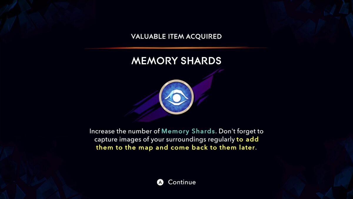

In another area we receive our first item that later I realize that it is the way the game shows the player any new gear, ability, item or text in the environment we get. I love the way that these items are shown because it allows me to use NVDA to read them easily. That’s why I always can read everything despite the lack of in-game screen reader; it simply works perfectly.
Visuals
The overall contrast is awesome. Everything is so colorful, filled with visual effects and cues. Most of them I explain in other sections of this review, but there are a lot of details, more than we would initially expect from a 2.5D game.
During combat we have normal attacks that don’t have any visual cue, yellow attacks that can be dodged or perfectly timed parried or red attacks that can only be dodged. These cues are extremely visible in every environment.
While platforming, there are many objects that can be used and most of them have distinct colors to them, helping so much to identify where to go next. The visuals are simply great prioritizing visibility. While traversing and attempting to find the next Wak-Wak tree to save, a visual effect appears on screen with a very decent distance. It becomes so effortless to follow it to get to them.
Also, and this is not told to the player, when near a Fast Travel point, a visual effect is displayed on screen. It looks like that visual effect that is used to indicate low health around the screen but in purple. Once I realized that that visual effect was for that, there were no Fast Travel that could escape from me. Even on the darkest areas have a light source to help you. I will not say much to avoid spoilers, but what I mean is that the team thought about every detail.
Platforming
Prince of Persia is well known for its complex platforming, and The Lost Crown is no exception. Although at the beginning of the game, it is quite simple to perform any of them, thanks to accurate light sources and visual effects that helps a lot to see environmental objects we can use. Later in the game we really experience the hard platforming, and some of them are wild. But I’m glad to say that even the most challenging platforming sections are super fun for me, and I had no issues other than dying a bunch of times, especially in those that we must do to get valuable rewards. I left nothing behind during my first playthrough, at least nothing that Sargon could reach. I was having so much fun and I wanted to explore every single corner of the map.
The worst part are certain darker areas. A very few platforms blend with the background, but most of them can be more visible when moving the right analog up for a better angle. Sometimes we can see a light source on top of the platform by doing that, but these platforms are rare. I remember very well that the reason I was able to play the first trilogy was because of the right lighting in the right place. In this new game it is way better than before. There are so many different objects we must use that I will not specify them to avoid spoilers, but they have a distinct color and are visible all the time. They can be blue, orange, red and in different forms and shapes. As I’ve mentioned just now, everything worked just fine for me.


The most interesting thing here is that I rarely use the High Contrast Mode in this game. I only use it in situations that I am struggling more than usual, especially in sections with tons of spikes or traps, but I see myself turning it off quickly. The only preset I found useful is Preset 1 that colors environmental hazards as purple. I personally see better without High Contrast mode than the second and third presets. But don’t get me wrong, it was super useful on certain occasions.
One thing I want to say about the High Contrast Mode and the main reason for me not using it much, is the fact that it does not have a toggle feature to it. I would love to quickly toggle it to see elements that I would not see at first glance. When a game has this feature, it is crucial that it has a toggle. This is for three reasons: one, because even if a player needs it, they might not need to use it all the time. Two, because it’s very tiresome having to pause, access the menu and all that every time. Three, it breaks the flow of gameplay, breaking immersion and requiring you to refocus your vision.
Combat
I could resume this section with a single sentence: combat is super fun thanks to the audio and visuals. But first things first. Playing at Medium difficulty, the combat is challenging, but not all the time. What makes it more challenging depends on the area and how difficult that area is to overcome enemies and platforming, because every bit of health helps. If we lose a lot of health navigating on the map, the upcoming fights will be harder of course. But talking about what’s important for this review, the level of visual and audio feedback in combat is incredible, giving context and awareness.
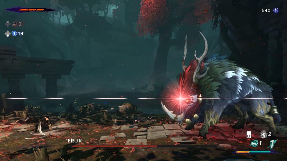

All attacks can be dodged, but normal and yellow attacks can be parried too. Normal attacks don’t have any color, but those are not as punishing as yellow and red. Yellow can only be parried if timed right, and a yellow visual effect along with an audio cue helps signal that. The red attack is also easy to see. Enemies have different levels of combat skills, and they can parry you as well. When you’re attacking and they block one of your attacks, it has another visual effect and another sound cue. Grunts and attack preparation noises also helps during a fight. Because of all these visuals and cues, I never had to try a boss more than a couple times to beat them. While hitting enemies and filling the Athra Gauge, there is a visual effect meaning that you filled enough to use one of your Surge powers.
Audio
Many audio cues are related to combat like I just mentioned above, but there is more to it. When at low health, we can hear the heartbeat very loud. Many games have this sound effect too low, making it hard to hear in the heat of a fight, but here is clear at any time, even during the most chaotic moments.
Some of the most useful sounds are from traps that are about to trigger, we can hear them before they do. All hazards have sound effects playing before they trigger, and that to be honest is amazing.
The menu audio feedback is simple but good. It makes a sound effect while moving between elements and another sound effect when changing any option using right and left direction. When changing Amulets, it makes a different sound if we equip / unequip. It should be like that in every game in my opinion. A successful / unsuccessful action is very clear through sound.
These Amulets can change the way you play, and they have a huge role in The Lost Crown. We have this Amulet we get early in the game that plays a sound cue of a bird singing to let you know we can collect something nearby, warns us about hidden breakable walls, puzzles etc. Later in the game we get another one that I will not mention what it does to avoid spoilers. I would rather have that as a core feature, because this way I could save that Amulet slot for something else, but because that Amulet is crucial to me, I used it since the beginning. Let’s simply say I cannot live without it. I have always been a fan of Ubisoft’s sound designers, and the sound design level in The Lost Crown is as good as in those huge open world games.
Map
Let’s talk about the best map ever made. Yes, you read it right. For me, this is one heck of a map.
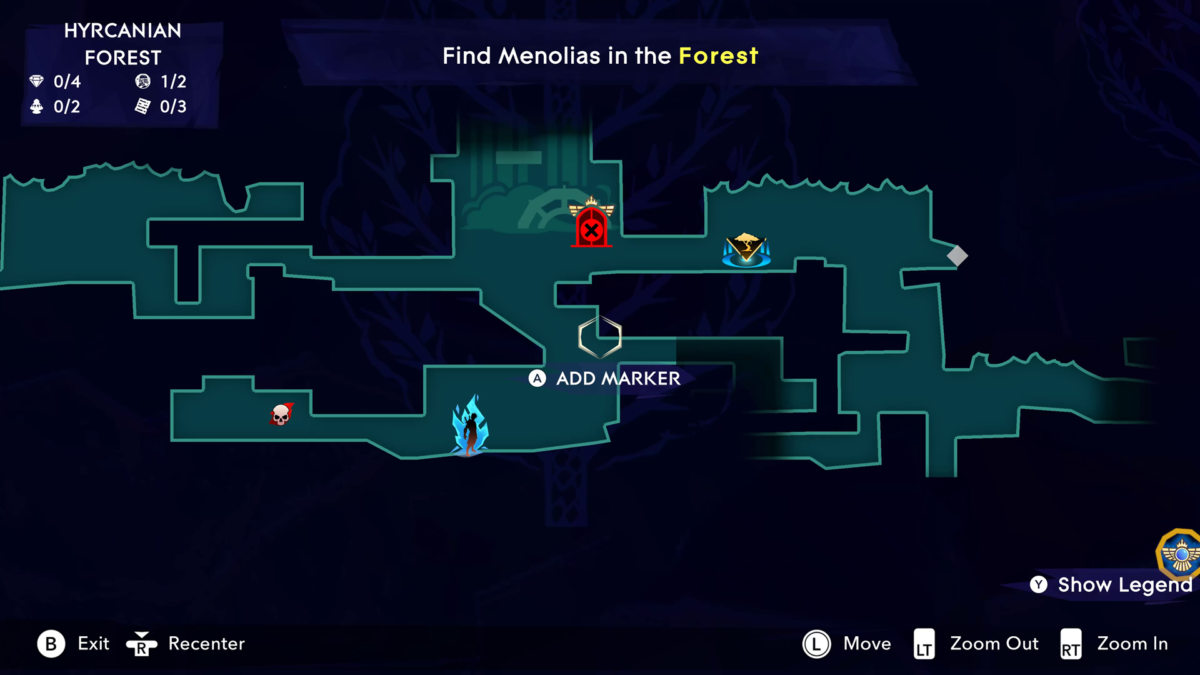

First, every single area is represented by colors. This is to help the player to know where an area starts and ends. This is so important on a map like this, and if it was not for this, I wouldn’t know where I exactly am. Also, when we buy the map for a zone, the areas we have not visited yet show the layout, but they are dark inside, meaning you have not been there. Otherwise, it would’ve been colored in the same the color of that area. This makes the feature 100% consistent and helps tremendously.
The map’s icons are very distinct and have different colors. Wak-Wak Trees, Objectives, Fast-travel points, Side Quests, Shops, etc. All these icons are very good, but I want to highlight the main Objectives, Locked / Unlocked Paths, Unexplored paths and Wak-Wak Trees. These icons are superb and make it so easy to see and differentiate. Of course, I must use very often the Windows magnifier, but that I must do in 99% of the games I play.
On top of that, when pressing the Y/Triangle button, we can show or hide the map’s legend. Why does make this legend different from any other, you may ask. Let’s say you’re trying to find a Wak-Wak Tree nearby, or trying to find unexplored areas so you can uncover the map. When opening this legend and selecting the Wak-Wak Tree, pressing the right or left analogs or D-Pads, it’s going to navigate between all available icons. You select a Fast Travel point, press right or left and it will move between all of them. This is amazing and I wish more games did the same. This helps so much because this way I don’t need to spend a lot of time scanning the map so I can find something, I simply use this feature and it shows me everything I need. When using a Fast travel point, the way you navigate between each point is the same but using the up and down arrows.
Another nice detail among these I just mentioned. When zooming in, we can read the names of each area with huge text size. It not only shows things bigger, but also text. In other words, one less time opening the magnifier to read. And things don’t stop there yet. We can put hand markers to remind you to go there later. We can select between many icons, but I personally don’t use this much because I use another feature, Memory Shards. When in a place that we might not know what to do, by holding the D-Pad down, we can take a snapshot of that place to remind you later. This icon is very distinct on the map as well. I use this all the time to make sure I don’t miss anything. This feature is a must have for one simple reason. If you discover that area and you forget to take a picture by using these memories, nothing will be shown on that place, so this is the only way for you to remember that place. This game is huge, and after spending hours and hours playing, everyone will eventually forget what was behind, so, there we have it.
Knowing where Sargon is on the map is also super easy. The icon is big and distinct from the rest as well. While scanning the map, pressing the R3 button will center your position in the middle of the map.
Menus


Knowing already that the game does not have a Screen Reader feature, I was curious to see if I would struggle with these menus. Thankfully the contrast, text size, font and spacing are excellent. When navigating in the Amulets menu for example, the highlighted Amulet is extremely easy to see. Also, when equipping one, the Amulet square is colored in blue along with two different audio cues. While shopping, I simply zoom at the place where the item descriptions are displayed and I read them while I move between items.
A cool detail for those using Windows magnifier but they play with a controller is that you can read everything using the mouse cursor while you control the game with the controller. Unless you press any mouse button, it will only recognize the controller. This could be a hell of a solution for many games, especially those games with floating text, as it would allow me to read using this method.
Assistances
At first, I had the Auto-Unfreeze feature disabled, but later I enabled it because I couldn’t understand what kind of input I had to perform to Unfreeze myself. As I’ve mentioned earlier in this review, I only use Visible Interactions, Disable Screen Shake Effects and Auto-Unfreeze, but there are more features that I don’t use that can help many players, and I should mention them as well.
The Aim Assist Strength set to Strong can help a lot during difficult fights or challenging platforming sections that require quick reaction. Although the Normal preset does work very well, it requires some adjustments when the target is out of reach. The Melee Targeting Assist can also be handy for many, it basically turns Sargon to the direction of the nearest target. Well, that was exactly how the old Prince of Persia games worked, but in this new game it is optional.
The last assist that I want to mention, and this one can be a life savior for those not too familiar with platforming games or struggle with them, is the Platforming Assist. This feature allows the player to create a portal to skip challenging platforming sections. Basically, when you get to one of these, you can use the portal and complete that section without struggling. Like I said, there are some really complex platforming sections, and this feature is here to avoid some of these huge game breakers for many.
Final Thoughts


The first Prince of Persia trilogy is one of my favorite games of all times, and I was so excited for this new entry. I wanted it to succeed at any level possible. I can confidently say that this is the most accessible platforming game I ever played. The overall contrast, the visual and audio cues, the extraordinary map, the menus simplicity and the way the information is presented combined make this game a top-notch experience.
As a low vision gamer, it is hard for me to play for long periods of time, but since I got this game, I just want to do my tasks fast so I can play all day non-stop, I just wanted to play it. That is when I know a game is accessible for me, when playing feels seamless. It is evident the care for small details and the passion behind this project. I couldn’t be happier with the work and efforts they put into such a beloved franchise of mine.
BEST FEATURES
- Great overall contrast.
- Menus text font, size and spacing.
- Excellent Guided Mode.
- Map with great design and features.
- Customizable difficulty for different aspects of the game.
- High Contrast Mode.
- Plenty of important Audio Cues.
- Assistance for the most complex parts of the game.
Needs Improvement
- No Screen Reader.
- Lack of a shortcut to toggle High Contrast Mode.


Victor is a gamer with very low vision who is passionate about game accessibility. When he is not glued to the PC, he spends his days with his dog on long walks in green and beautiful places. Trying to improve every day in order to contribute as much as possible with the accessibility community. You can contact him on Twitter at @VictorAndre87
Gaming Center
Gaming center adalah sebuah tempat atau fasilitas yang menyediakan berbagai perangkat dan layanan untuk bermain video game, baik di PC, konsol, maupun mesin arcade. Gaming center ini bisa dikunjungi oleh siapa saja yang ingin bermain game secara individu atau bersama teman-teman. Beberapa gaming center juga sering digunakan sebagai lokasi turnamen game atau esports.
